MAKING THIS WEBSITE: Thank God that's over.
FINALLY DONE.
As an Art Director, I look at a lot of folio websites. I felt it was time that I got my own together. It took around two months to go from sussing it out to a presentable state. I wanted to set up this site to host and document my work and connect with like minded people.
As it took me a while to figure it all out, I thought I'd outline what I did and maybe help someone else who might be thinking about setting their own up.
GETTING STARTED.
I found the best way to get started was to open a word document and write a massive list, with a rough task order. I added things to the list as I went and I found once I had the list I had a clear understanding of what had to be done. It also helped with time allocation, I picked tasks that fit the amount of spare time I had. This document also came in handy for keeping all the user names and passwords that I ammassed together in the one place.
As I usually do most of my thinking away from the computer I used an app called Clear, which is a very simple list app. I found it super helpful in capturing ideas and reminders for the site on the run.
Clear App.
SQUARESPACE.
I decided to use Squarespace to build and host my site. Around the time I was thinking about having a crack at the site, I was listening to the Serial Postcast series 'mail chimp' (or ‘mailkimp’) and squarespace were heavily advertised, so I checked them out while I was listening to the podcast.
www.squarespace.com
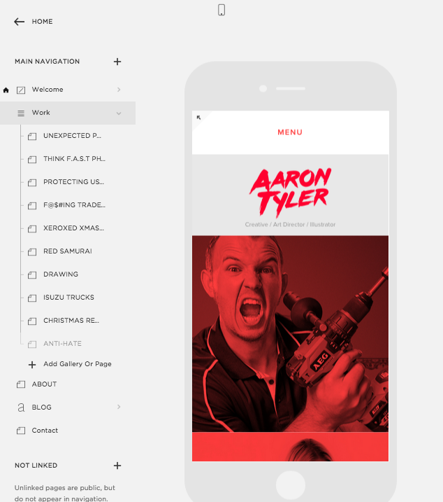
There were plenty of site templates to choose from which look shmick even at absolute default. I chose the Flatron template because I felt it gave a good overview of my work. You can dramatically change the look of them if you wish. You can also take it one step further and add your own, or edit the CSS to get the site to do things that squarespace doesn’t provide. This site hasn’t had anything added to it, but I have a feeling I will as needs present themselves.
Pages list.
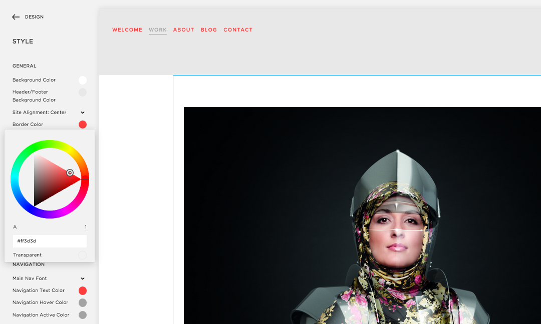
It took a couple of hours to get comfortable with it, but the the editing options are easy to use. The style editor is where you do most create the look of the site using a simple side panel, all the changes update in real time.
Style editer.
You can insert content directly into the layout and then basically drag and drop things into place. Squarespace automatically adjust sizes of images so the site loads as fast as possible too.
Inserting image content block into site.
After a while I had hundreds of files sitting on my desktop. Definately worth setting up a folder system early to keep all the files you have uploaded to the site in order. A proper system came in handy when I changed my mind about something and needed to dig it out and change it.
Once the content is inserted into the pages, it can editied further.
The method I used to design the site, was to sit there logged into the editing panel, while keeping another tab with the live link open sp I could keep on refreshing after changes were made. Checking the site live as I went made sure everything I was doing in the editor translated nicely into the sites design.
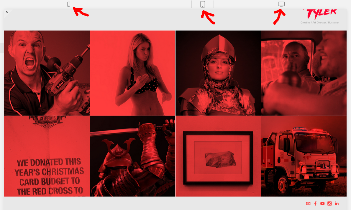
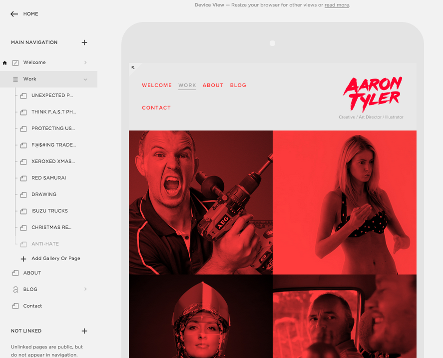
If you want to see what your site looks like on other devices, Squarespace has a function where you can drag the browser window from desktop view, to tablet and then mobile view. I found this really helpful in making sure everything worked across all devices. That being said, I also had my phone next to me the whole time to test the site on a real phone.
I also liked how Squarespace had a 14 day trail, where I could start creating the site without putting any money down. As well as editing the site, you get a live link so you can see the site without having it linked to a domain name.
The site is easy to make, but if you find yourself up shit creek (I like did once), Squarespace has fantastic customer service. I got a response within an hour of sending an enquiry, with a custom made video showing me exactly what I was doing wrong. Brilliant.
DOMAIN.
You can register a domain name through Squarespace, but I already had aarontyler.com.au registered through Crazy Domains. I've heard a lot of complaints about Crazy Domains, but in my experience so far, I haven’t had any issues so far. And you get to see Pamela Anderson every time you log on there.
Tattoo is a bit airbrushed.
There is plenty of info on how to point your domain to your website. Although there is slight differences between every hosting site, you will never find exactly the answer you're after, but rather a rough idea. Bit of trial and error, but you get the jist. Persist through this process or just call your online design mates.
The most annoying part about this process is waiting for your website to propagate around the internet. I used this website to check its progress. All up it took over 24 hours before my site was live.
DESIGN.
I discovered many different websites along the way but eventually settled on the 'Flatron' template. It is a 'portfolio' template and is perfect for presenting the work.
I've always liked red, and I felt it would be bold enough to make the site memorable as well as link all the various social and hosting pages together visually.
Initially, I wanted to have every element on the site in red. This looked very fresh and I was very stoked with it, until I started showing people and no one could figure out how to use the site. Reluctantly, I started introducing white/grey back into the pages. Works a lot better now.
I made the Projects windows red.
Continued the red for outdoor to bring focus to the work.
BRANDING.
Designing your own brand name is just about the hardest thing I've had to do. I've designed hundreds of logos before, but never really had a crack at my own. I underestimated how annoying it could be.
I explored many different approaches for my logo. I ended up purchasing the above font for around 30 bucks. It's somewhere between the 'Friday the 13th' style that I explored initially and an 80s brush font.
Here a selection of logo territories I explored. I think where I ended up has elements from a couple of them. (Major thanks to all the people I got feed back from about these)
SOCIAL/HOST ACCOUNTS.
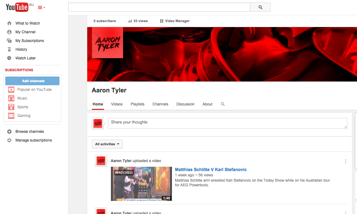
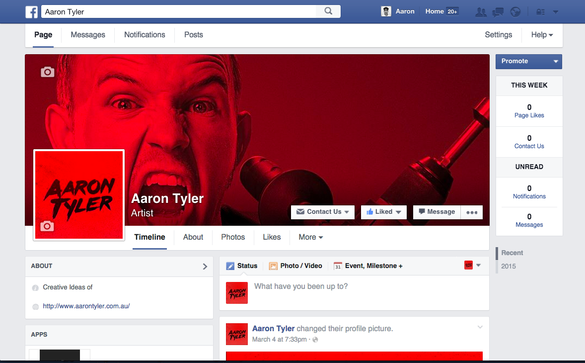
I also created a YouTube, Facebook page, Tumblr, and Sound Cloud. I already had Instagram. These will used to host a lot of the content presented on the site, as well as build a following for anyone who is interested in my work. I have very few friends on these atm so please feel free to add me up.
BLOG.
I've read a lot of blogs in my time, but never really established one myself until now.
I'm want to document and share what I'm working on as a way of connecting with like minded people. People that know me know that my first round grammar and spelling is at a primary school level, so I hope that being a bit more proactive with writing will help me out in this department.
I started doing interviews a while with other creative people that I have discovered. I have posted one I did with David Watts who established a 3D scanning studio in Tokyo. I plan to do more of these in order to learn more stuff and share it with others. Subscribe to my email list if you would like to see more of these.
PROFILE.
I checked out a couple of other creative/artists bios for some ideas on how to approach mine. Some had lengthy descriptions, others didnt even have one at all. I decided to keep it real short, breaking up my About, Education and the Publications my art had been printed in. The mugshot was taken by Garth Oriander.
CONTACT.
Contact page has the option to sign up or email directly.
80% RULE
The 80% rule is for perfectionists who have an unrealistic idea of when a project is 'done', because they believe it can always be better. It's these unrealistic expectations that can become a barrier preventing a project from getting off the ground. I got this site to about 80% done, then started telling people about it. I knew there were things I wanted to improve, but I'll work on those in time.
This way I wasn't going to spend the next 6 months perfecting something that I will probably get sick of before it was even done.
THANKS FOR READING.
Send me an email if anyone would like to ask any questions. I'm planning on doing some good stuff on here, so please subscribe if your interested. No spam, just quality shit.


